As news of our shop started to spread, people began to persistently ask how we came up with our “adorable” logo. The short answer? We thought it was bright, fun, and family friendly – the perfect portrayal of the brand we wanted to create. The long answer? Welcome to blog number 3 as I attempt to paraphrase practically 2 years of designing, tweaking, and chasing out-of-the-box ideas just to revert to designs we had already nixed (or so we thought). After a few rounds of quite the artistic roller coaster, we finally decided to combine three logos and landed on what we anticipate will become the iconic brand of Jubie’s Creamery.

Now, I already know what each and every one of you is thinking. Where did the elephant come from? What does it have to do with ice cream? Let me ask you one quick question before I explain. What do the logos for Wendy’s, Disney, and Starbucks all have in common? Here’s a hint: think red hair and freckles, mouse ears, and the queen of coffee. Using a mascot in a logo is not only eye-catching and unique, but it also creates a lasting impression long after you get in your car and head home. Of course, a cow is the most obvious (and in our opinion, the most predictable) mascot for an ice cream shop, but here at Jubie’s, we don’t want to be just like every other ice cream place around. Our goal was most certainly not to reinvent the wheel, but we do believe that our customers deserve a fresh, new outlook on the traditional ice cream parlor vibe.
My senior year of high school I was enrolled in wood shop where we were tasked to use the skills we learned throughout the semester to make a lamp. Everyone around me created lamps based off their favorite sports team, TV show, or time period while I decided to base my lamp off my favorite animal – an elephant. The day I took my assignment home was the day that Jubie’s Creamery got a face… as well as a trunk that could wrap perfectly around a double-dip cone and some very large ears. It was the eye-catching mascot we had been searching for, and thus began our branding journey.
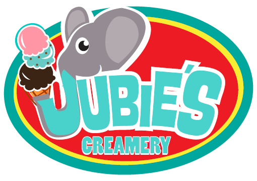
The first mock-ups were beautifully hand-drawn and featured our star elephant as three very distinct characters. We wanted the Jubie’s elephant to be cheerful and inviting in order to achieve the experience we are striving to give our customers. While I decided to incorporate the elephant’s trunk into the neck of the lamp, we loved the idea of adopting it as the J in Jubie’s. With these notes and a few other tweaks, our first digital logo was born.

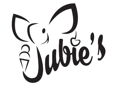
While this version was closer to what we imagined, it still wasn’t right. We began to quickly realize that the brand we wanted to create walked a very thin line between childlike and cutesy. Keeping our goals of bright, fun, and family friendly in mind, we wanted to nail down a design that strayed away from childlike and appealed to a much broader audience. Our focus turned to the drawing itself, putting bright on the back burner until we achieved the look of both fun and family friendly. So, without further ado, let me introduce you to digital design number 2.

It was love at first sight, and for a while we dedicated a lot of our time to making this design into the Jubie’s Creamery brand. We felt we had the perfect depiction of fun and family friendly so we moved on to our third and final objective. After a while, we realized that not all first loves last forever, and this was no exception. Once we started adding colors to the logo it not only seemed hard to read, but also hard to decipher the image. Was it an elephant? Was it a mouse? Was it really a J? The last thing we wanted was our customers playing a guessing game. So, after weeks of various color scheme fails we were a little defeated and a lot off-track.

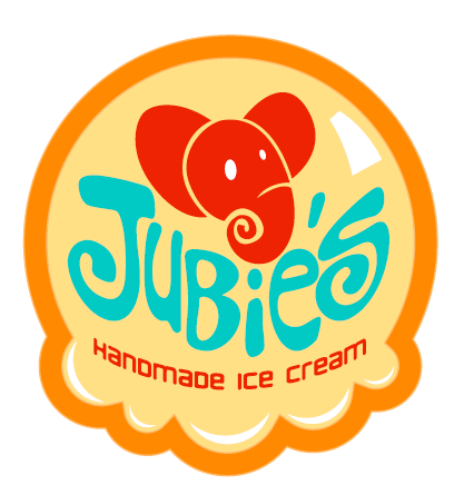
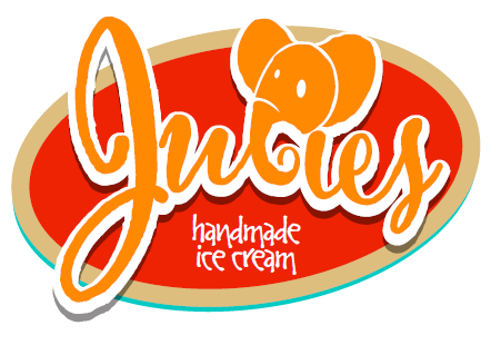
Amidst the two logos that we’ve used thus far were tons of other designs that, for one reason or another, were vetoed. FYI you can see some of our “favorite fails” in the slideshow at the end of the blog. After trying every color combination possible, we were still unable to shake the feeling that this one was not THE one. So, we pulled out some past drawings hoping to spark some creativity. What we found was a diamond in the ruff that paved the way to the logo we’ve all come to know and love today.

At first glance, it may not look very similar, but our final design was heavily based off this “failed” logo. From the color scheme and type style, all the way down to the shading, this design jumped right off the page and begged us to incorporate it. But there remained a very large elephant in the room—the omission of an elephant in the logo. We were too attached to the idea to let it go and decided to give it one last chance by morphing the elephants from the first two designs. What resulted was the face of Jubie’s Creamery, and it turned out far better than anything we had ever envisioned.

Deciding on a final design was a huge milestone considering all of the decisions we have made (and will make) have somehow been based off this new friend of ours. From the lighting in the ceiling all the way down to the type of floor, we've looked to our logo as a constant reminder of the experience we are trying to create for our guests. While this process has proved itself to be more difficult than we originally anticipated, we could not have had a happier ending. The best part? The overwhelming support we have already received for the most recent addition to our Ice Cream Family.
-Jubie
Click the right and left arrows to view some of our favorite old logo designs.


